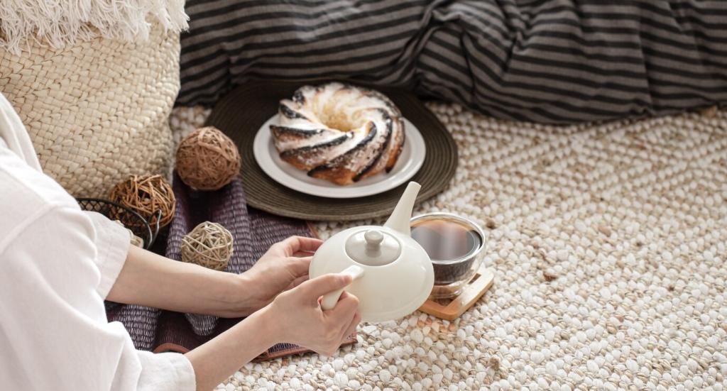

Whispered Color Pops: Sage, Blush, and Misty Blue
Rotate a sage throw in spring, blush cushion covers for summer warmth, and misty blue ceramics for winter light. These subtle shifts echo the landscape outside, keeping rooms alive without repainting. Share your seasonal swaps with our community for fresh ideas.
Whispered Color Pops: Sage, Blush, and Misty Blue
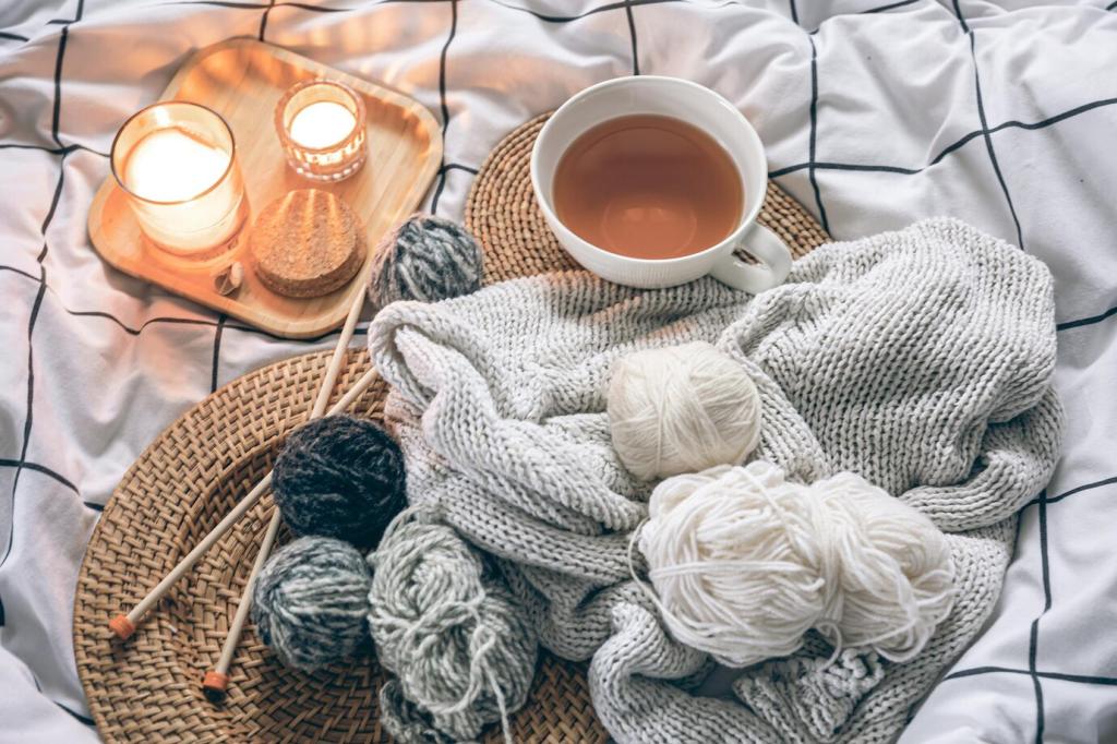
Small-format art with muted palettes, matte-glazed vases, and linen-bound books in dusty tones introduce personality. Cluster them on a tray to avoid clutter. This approach makes color intentional, portable, and easy to edit when you crave a quieter corner.